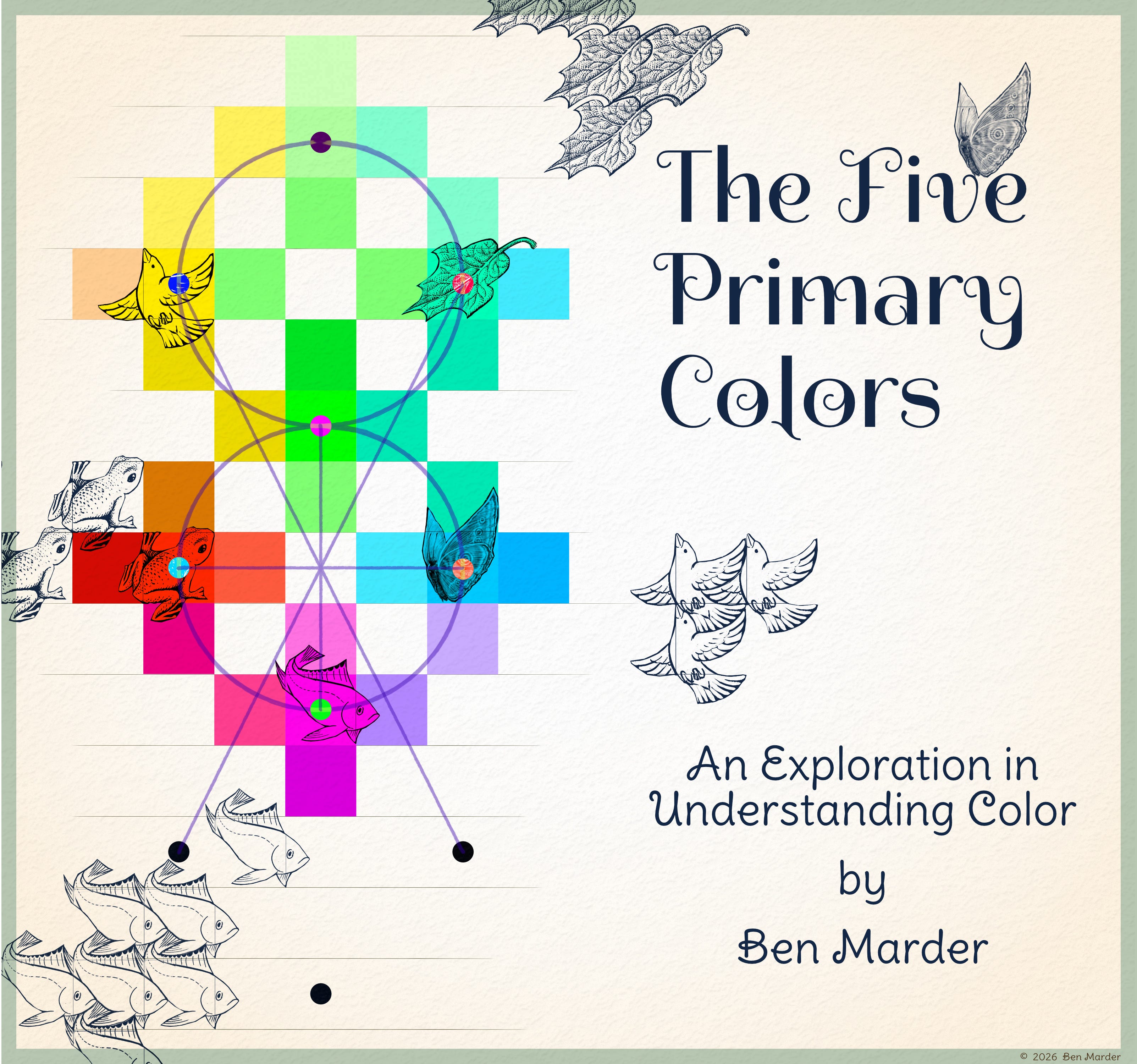
The Five Primary Colors
An Exploration in Understanding Color by Ben Marder

Introduction
We have all been told there are three primary colors. When I became an art teacher, I began to vocalize why I felt this was misleading. I was always instinctual when it came to color mixing and was turned off by being taught much about it. Even so, my task now is to explain why five primary colors are a better fit than three. As I delve into the complexity of this, I am also compelled to open up our perception of what color is. For color does not have to be part of our modus operandi. When we try to understand color from a rational perspective, we may lose the experiential richness it has to offer.
I was not always a good student in art school. I was often filled with a sense of what I wanted the outcome to be and did not allow constructive thoughts to enter my awareness. Reflecting on this now, I think I was working through something that was not going to come through schooling. I see now that as artists, we often get in our own way. I have learned to have compassion for myself, which informs my students that compassion is a necessary ingredient in the art-making process. I feel lucky that I was given the time and space to approach art-making in a way that opens me up, rather than shuts me down.
The Colors and their Placement
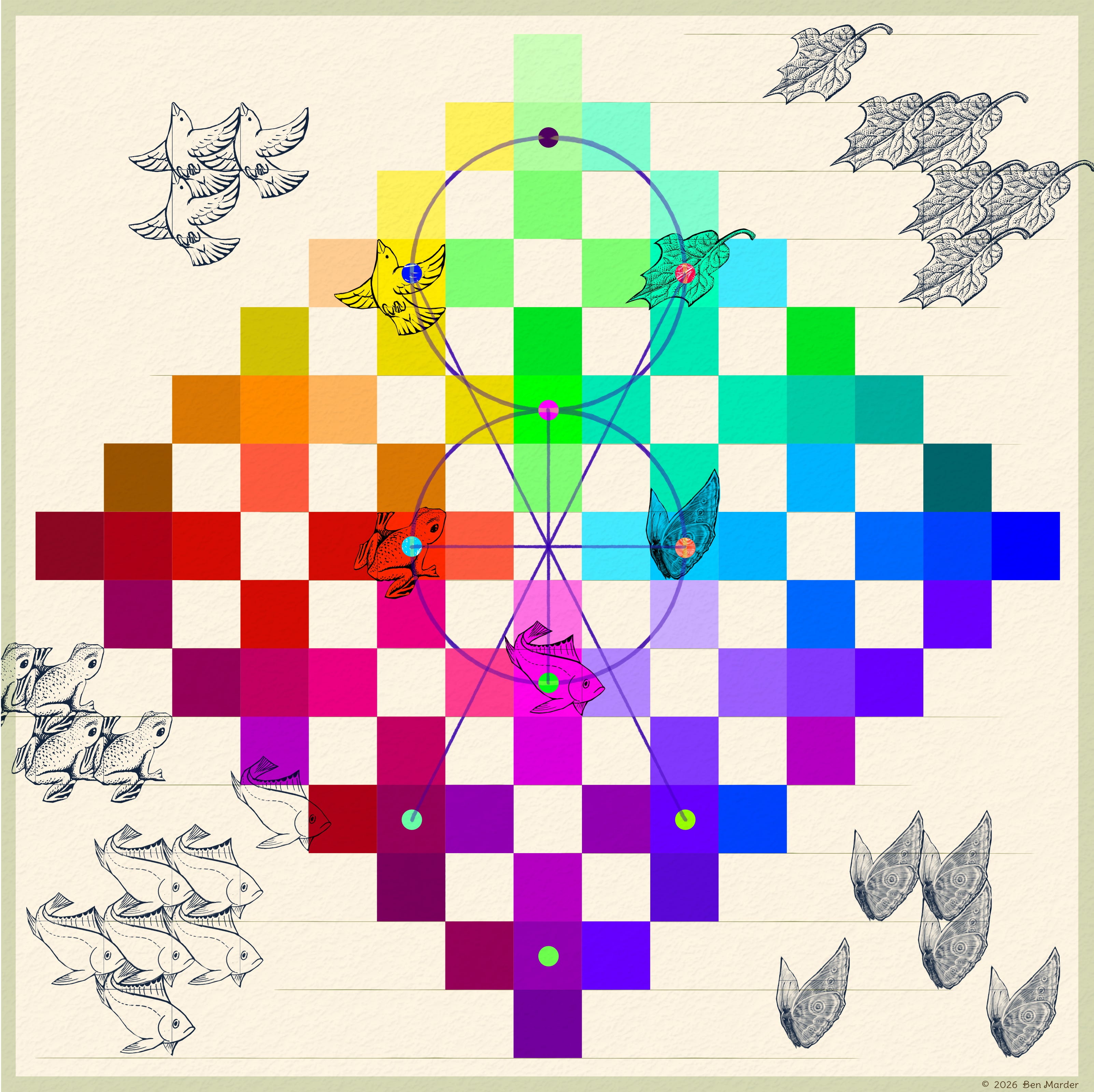
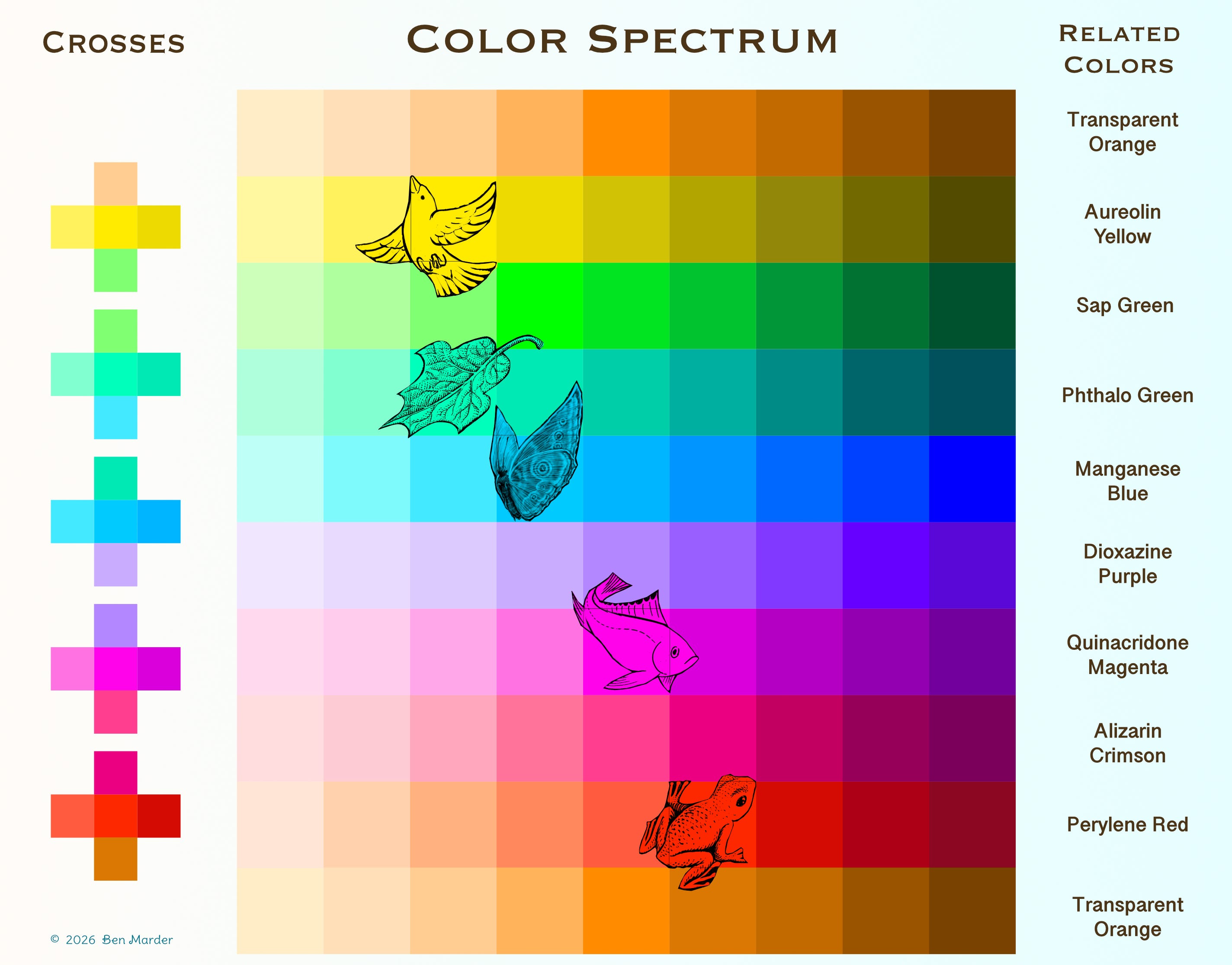
Let’s break down the color chart I made practically before delving deeper into the inspiring realm of color. I will also talk about my understanding of the Five Primary Colors and why I see them as such. (A full image of the chart is shown a little further down.)
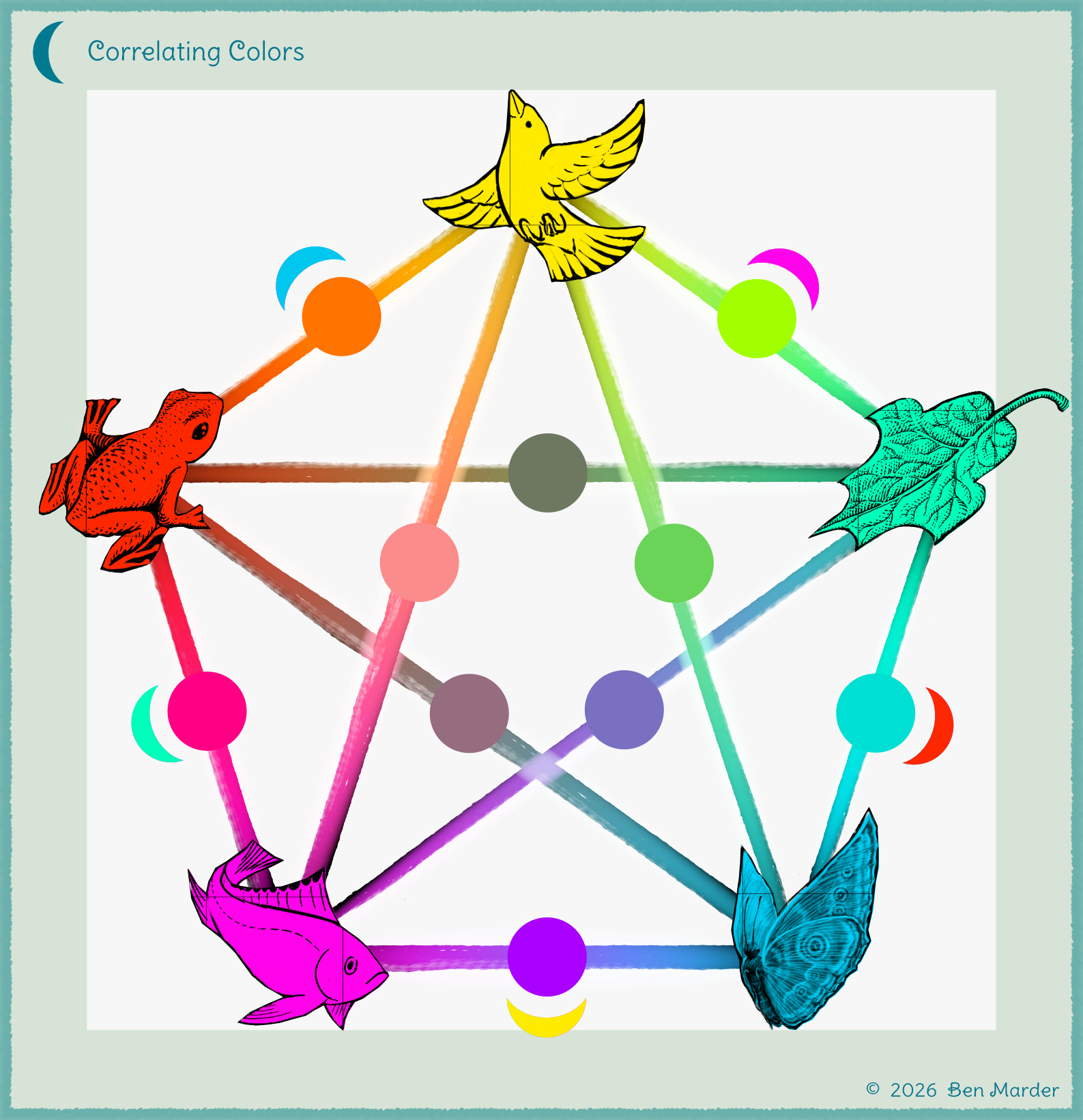
I have related the primary colors to animals and plants because, when we see those species, we understand how marvelous their colors are. Not just how they are, but how diverse they appear and what the light of their bodies does as our sight reaches them. I have given the primary colors names respectively and have arranged the spectrum with the intention of creating meaning between colors so that there is a visual representation of the colors I am perceiving. The five primary colors have a purposeful placement and are identified not only by color but by their arrangement in space.
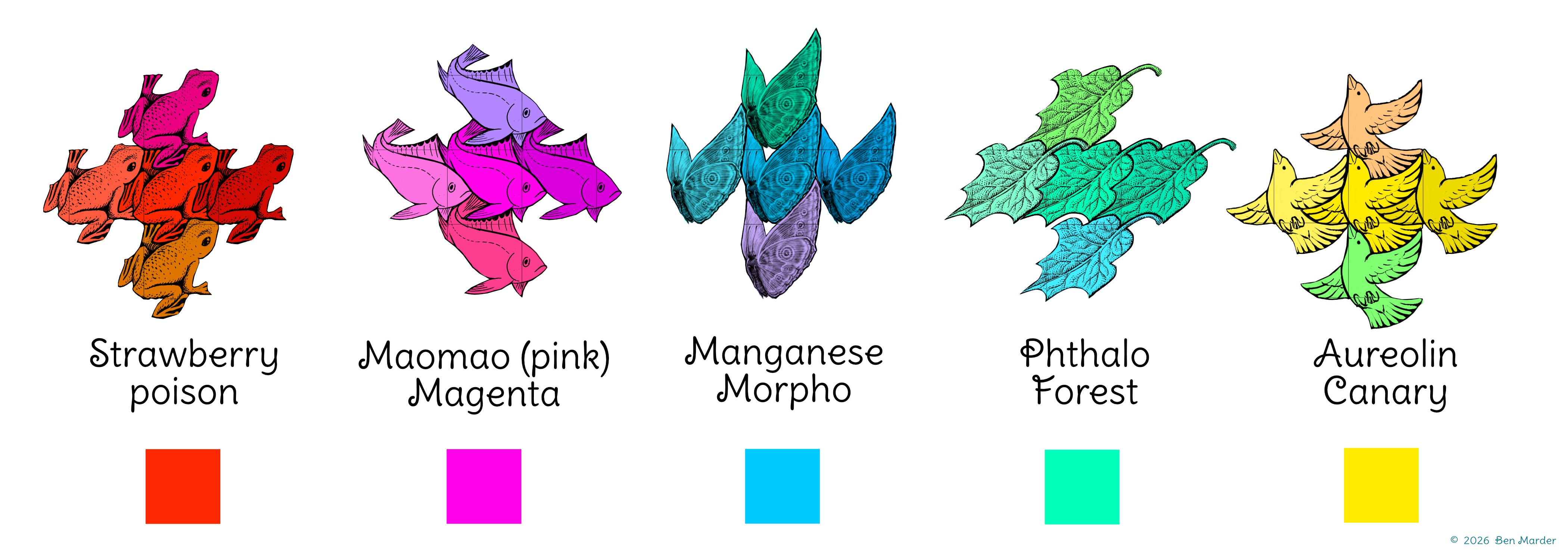
In this chart, the concept of red, yellow, and blue is still a feature, but the understanding of what they offer is different. Red is Strawberry Poison and is not alone in its flamboyant glory; but has a friend, Maomao (Pink) Magenta. Blue is Manganese Morpho next to Phthalo Forest. Lastly, we have our lovely Aureolin Canary (Yellow). Every color in the chart offers a spectrum that moves in four directions, forming a cross. This cross represents the changes of color in nature. As colors darken, they also become cooler. This parallels how pigment works and perhaps light as well. When pigment is denser, it feels cooler, and when it is thinned out, it naturally becomes lighter and sometimes warmer too. More about pigments as we go.
I am sure you know that red mixed with blue makes purple. When you mix red and blue, they create a common purple that might lack the complexity of the color you see in a violet flower. The difference lies in our perception of purple as it shifts into a fluorescent spectrum. You may feel frustrated when trying to create a vibrant purple by mixing with traditional primary colors, because the quality of purple comes from the presence of magenta in either the red or blue.
A similar issue arises when mixing greens. Yes, blue and yellow make a wonderfully earthy green, but these greens lack the emerald notes you find in leaves or the turquoise notes you see when looking at the ocean. While red, yellow, and blue are still appropriate in color mixing, I understand they have their limitations. We simply cannot mix all colors from the traditional set, but let’s look at this from the other direction: Are the “Five Primary Colors” true primary colors in the sense that they can’t be mixed from other colors?
To answer this question, it is appropriate to acknowledge that some reds, yellows, and blues are the result of mixing two pigments, or they are a chemical compound that exists without too much explanation of how it came to be. What I am getting at is that when we say red, yellow, and blue, we are saying they are an approximation of an ideal. Therefore, we are not actually saying there is a true set of three primary colors, but rather a placeholder for idealized colors. This feels a little disenchanting to me; however, when we add Maomao Magenta and Phthalo Forest, we get much closer to understanding what it would mean to have a true set of primary colors. Our concept of primary colors is now more nuanced. The colors I have provided behave in the way pigment behaves—they are a spectrum.
It’s hard for me not to acknowledge that Maomao Magenta appears to be in the red spectrum and that Phthalo Forest caters towards blue. However, distinguishing colors as separate from each other is part of the dilemma we find ourselves in. This has to do with how we privilege one thing over another, rather than allowing insight to enter our logic.
What is Phthalo Forest, and is it a mixable color? Phthalo Forest feels deep and cool like blue but is distinct from the blue spectrum. It cannot be mixed by adding a “primary” blue and yellow. On the surface, it appears that it is mixable because we interpret it as being green, but it is not green, nor is it yellow. The question is: does Phthalo Forest’s turquoise notes outshine the primary colors yellow and blue? Its turquoise notes are not derived from yellow, nor are its blue notes consecrated by the qualities of a sky color like Manganese Morpho. When we mix Manganese Morpho with Canary Yellow, we get a mossy green. I find you can’t mix some colors without Phthalo Forest. For example, when mixing yellow into Phthalo Forest, we get an intense lime or sap green, which holds the position opposite of Maomao Magenta on the chart.
What about Maomao Magenta? When we think about mixing Maomao Magenta, you would probably start with a deep rose and add a little blue, but even this might not get you there. You basically have to start with a magenta or rose. So, I don’t think Maomao Magenta is a mixable color. It’s possible to mix some light pinks from red, but magenta is another story.
Let me also talk about Manganese Morpho (blue) and Strawberry Poison (red) as part of the Five Primary Colors. Manganese Morpho could be the color of the sky on a crystal clear day. Look at the sky and see the spectrum there. It is warm, light, and clear, as well as deep further above the horizon. It recedes into space, whereas Strawberry Poison comes forward. Strawberry Poison has a notable punctuation in its surroundings. Think of poppy flowers in a field, or how the Strawberry Poison Dart frog announces its toxicity. Both Manganese Morpho and Strawberry Poison have the capacity to become deep and saturated, as well as bright and illuminated when thinned out. Mind you, I am thinking in terms of pigment now. I have not encountered a true Strawberry Poison pigment, but nature always holds the key to what is possible.
Aureolin Canary (yellow) does not have a counterpart color, or you could say that its counterpart is Phthalo Forest due to their perceived lightness on the chart. Yellow is a hard color to explain, but perhaps that is true of all colors. Being the lightest of the original primary colors, yellow takes on qualities of other colors more effortlessly. It is generous in this way.
Pigment and Light
I am expressing color in terms of pigment; however, in this article, I am using the computer to help me arrange colors. I have lots of experience mixing paint but found it easier to play with colors digitally for this project. There is also the reality of photographing physical artwork and how colors translate differently in photographs. I hate that I have to say this, but there is no use of A.I. in any part of my artwork.
In general, computers isolate colors, and that’s useful in some ways but limiting when we are talking about the complexity of light. CMYK colors have been around for a while. CMYK is how computers make sense of printing images. It blends colors with a pointillism effect. So the colors are not actually blended but exist as dots clustering on a page. CMYK stands for Cyan, Magenta, Yellow, and Black.
I have been hinting at what makes pigments unique. Typically, our understanding of color is that hue (tints of color) and value (lights and darks) are separate phenomena. When it comes to painting and perceiving light, we are always getting closer but never approaching true black or true white. So what does this say about the representation of value in our paintings? Many people say that value is more important than hue, but my opinion differs.
Darks and lights can come from concentrating pigments or mixing pigments together, excluding the reality of black and white pigment. That is to say that when we look at something that is dark, often we are seeing a color rather than black pigment. Dark notes are influenced by what is happening in the light. If we were to really paint how we are observing something in the light, bright moments would exist with limpid variations of color. You would hardly see a true white. Sometimes in darkness, we temporarily lose our sense of relativity, but dark colors rarely go completely black and are often flavored by their neighbors. Black pigment is a wonderful reality, but to “paint light”, it helps to understand that there is no such thing as true black or true white. However, we do perceive darks and lights, and that’s one reason why we use black and white paint.
If not black and white, then what? Let’s keep thinking about pigment. Darkness is a feature of life. When the sun goes down, color is not lost; rather, color absorbs more color into itself. Pigments at night are in the presence of a greater amount of color in the atmosphere, so they absorb the dominant color. You might say colors are drawn to each other. So what is this greater presence of color at night? Most people would say black is disguising the color we see in daylight, but I’m inspired to think about it differently.
Let’s think about the darkness as harmonizing in an all-pervasive oneness. To be dark is to come into a greater chorus with everything. To make sense of this, we can look at a phenomenon that happens when we mix complimentary colors together. In most cases, mixing two complementary colors (or opposite colors) balances them, and we see them as being darker and earthier. Remember colors do not go away in the dress of the night, but rather close their eyes and open to darkness. All colors are simpatico and express themselves in unity, although unity is not to be confused with singularity. Colors remain themselves but want to move towards darkness to express a common heritage. We are still talking about pigment; whereas if we are talking about the non-physical, such as light, a similar reality would exist in congruent nature. Meaning that in light, all things want to come together and experience unity as well. In light, the presence of white is actually the presence of colors merging, just like they do in darkness. This is also color simpatico. Being as we can’t paint with light (as of now), I am talking about pigment, darkness, and physicality.
So what are Simpatico Colors, and how can we understand them? Unity arrives in the form of a triad. With Simpatico Colors, this triad is made by mixing two colors in concentrated amounts—concentrated Maomao Magenta and concentrated Phthalo Forest. When you mix concentrated (dark) magenta and concentrated (dark) Phthalo together, you can come up with a family of colors in the indigo lineage. The result of mixing makes a neutral dark hue that looks like indigo. On the warmer side is a hue that looks like an “urban night sky,” and on the cooler side is a hue that looks like a “nighttime forest.” To darken all colors towards black, you may add neutral indigo or a warm urban night sky or cool nighttime forest. Color pigments are not lost because this triad can work with their warm and cool properties without diminishing the original color. These colors show us how all colors come together in darkness because they are an expression of color without light—color simpatico.
Experiencing Color
So is color a pigment or an experience? The very first thing I tell my students when teaching them about color is that it is relational—a phenomenon of warm and cool colors coming together. Then they say, “What the hell are you talking about, Ben?” When we compare two colors, say red and yellow, one student sees one as warmer, while another student perceives the same color as being cooler. Indeed, if I am honest, I have the same experience and can’t find a way to talk about it objectively. My students are not wrong. That is to say, you can’t always fit colors into warm and cool families. There is something more going on. So, what are you talking about, Ben?
Colors can be perceived in surprising ways. As a teacher, I appreciate this but realize it is not always helpful to the student to hold such a broad perspective. So let’s start from experience: ask yourself right now how you are experiencing color. Take a moment and think about how color inspires you. How do these colors excite you? How do you feel them in your body? At what time of day do you see them? Have you dreamed about color recently? Now ask yourself if color is rational. Color is less rational than a greyscale. I would argue that the thing that makes color so compelling is that it always shows a living relationship occurring. Lights and darks speak about differences, whereas colors are not about comparison but vibration. Color pigment vibrates similarly to how light particles vibrate, even though pigments are perceived as being static. Colors on the page make vibrations as though they are constantly being woken up from sleep.
Colors exist in a continuum, not a spectrum. When we look at the color wheel, we see them in order. But that is not what color is. Color exists just as much in our perceptions and feelings as they do on a color wheel. It is sometimes helpful to say orange and blue are on opposite ends of the spectrum, but the joy of color mixing and painting is that it stirs up feelings. These feelings are connected to an expansive field of limitless possibilities. When we consider warm and cool colors in a continuum rather than as a spectrum, we begin to open up to an experience. You can’t single one color out from another. When I ask my students if yellow is warm or cool, I am missing the point. It would be better to ask, “What is your experience of yellow in this place and time?” This takes a leap of faith on the part of the student to answer but is a more relevant question. To express with color is to imagine it beyond a spectrum. It is possible for a “cool” color like blue to look “warmer” than a “warm” color like red. This is the excitement of color. As artists, we must take color out of the linear and move it into the continuum where it begins to sing.
It is also important to remember that when mixing colors, all art mediums work differently. For example, in oil painting, if you take a “cool” yellow, like lemon yellow, and add red to it, it “warms” up without complications. But it is harder to “cool” off a “warm” yellow through mixing unless you turn it into something other than yellow. Whereas in watercolor, it is the opposite. You should start with the warmer color to capture the light in your picture. If you start with the “cool” color, retrieving the warmth later on would be challenging.
When you paint, you are always looking at something in relation to something else. Depending on the medium you are working in, the five primary colors might not be ideal. For instance, in watercolor, Phthalo Forest might be too strong to use in your paintings. Sometimes, it is better to mix greens in a more traditional way.
Additionally, colors don’t look the same across all mediums. This is another reason why I gave them unique names in this article, because I don’t want to be responsible for saying exactly what they are, but rather to convey a sense of what they look like. I did not use any mathematical formulas when creating the swatches of color here; I simply hand-picked each color based on its neighbor. The visual below illustrates how the crosses on the chart were derived. I also feel, in retrospect, that the spectrums I came up with do, in some ways, relate to natural pigments, so I provided pigment names to place them in a broader context. I chose pigments that all demonstrate transparent color qualities, meaning they range from light to dark.
Lastly, here is the reimagined color wheel, which I don’t want to leave out. I am using the word “correlating” instead of “complementary,” as in “complementary colors.” The reason for this is that when beginning to understand color, many people think that complementary colors make good partners, whereas the term simply refers to opposites, not denoting what is tasteful. In fact, it’s often the case that complementary colors are loud—sometimes too loud for an image to sustain them.
Ben Marder is a Massachusetts-based artist, writer, and educator dedicated to exploring the beauty of the natural world through storytelling. A graduate of the Rhode Island School of Design, Ben combines his passions for art and teaching to inspire others in their creative journeys. His forthcoming children’s book, Little Eddaling, reflects his deep appreciation for nature and its role in fostering community and connection. When not in his studio, Ben is passionate about inner exploration, viewing nature as a profound medium for understanding the workings of the spirit and soul.
I might not respond to comments, but I am happy to read them.